
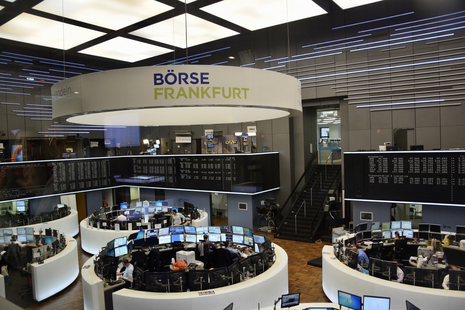
Seeing different markets in one table has a concrete benefit: you can read your whole portfolio at once, without moving between tabs. But that convenience has a side effect: two assets sitting on adjacent rows look like they trade under the same rules.
They do not. Crypto, Turkish equities and US equities differ in calendar, currency, liquidity and news flow. A comparison made without accounting for those differences usually produces not a wrong answer, but misplaced confidence.
Here are four differences worth holding in mind while you read one table.
1. The calendar is not shared
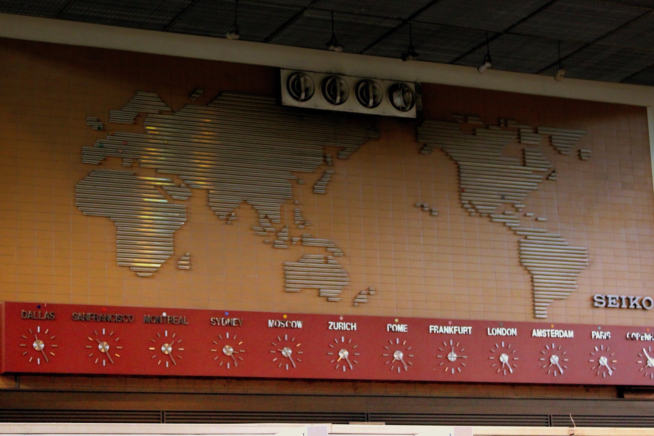
Crypto markets run continuously: weekends, public holidays and nights make no difference. Borsa İstanbul and the US exchanges are open during defined sessions; outside those hours no new trade updates the price.
The effect on the table is this: on a Sunday, the 24-hour change on a crypto row is live, while the “daily change” on an equity row is left over from Friday’s close. The two numbers sit side by side but describe different intervals.
Practical consequence: when you look at a portfolio snapshot on a weekend, remember that the equity side is frozen. News that breaks over the weekend only reaches the price on Monday, and that adjustment often happens in one move at the open.
2. Currency quietly changes the comparison
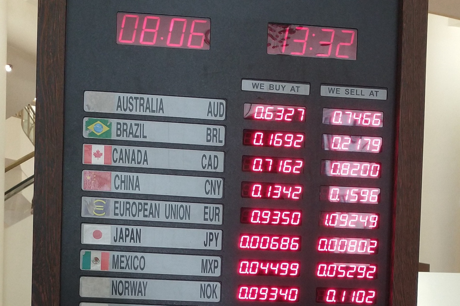
A stock on BIST is priced in Turkish lira, a US-listed stock in dollars, and many crypto assets are quoted against a dollar pair. To see a single total, all of those have to be converted into one currency.
The moment conversion happens, every return figure in the table carries two components: the asset’s own move and the currency move. A dollar-denominated asset can change in lira terms while the asset itself has not moved at all.
That is not a bug; it is the correct behaviour. But it has to be separated when reading. “My portfolio is up 8% this month” is an incomplete sentence until it says which currency it was measured in.
3. Liquidity decides how “real” a price is
Not every price in the table comes from the same depth. On a heavily traded large-cap, the last price is close to the level at which you could actually transact. On a thinly traded asset, the last price may be left over from a small trade that happened hours ago.
The same applies on the crypto side: large and small assets look identical in the table, but the spread and the size you can realistically move differ substantially.
Looking at volume alongside price adds what the table does not say on its own: could you actually get out at that price?
4. The same headline does not mean the same thing everywhere
Rate decisions, inflation prints and regulatory announcements affect all three markets, but the direction and the delay differ. Crypto reactions are usually immediate and sharp; equity reactions wait for the session open and then separate by sector.
Which is why a reading like “markets fell today” is usually wrong once you hold three asset classes. What fell was a particular market, and the others moved for a different reason, at a different hour.
So why is one table still worth it?
None of these differences is an argument against a single table. The opposite: the assets have to sit next to each other before the differences can be seen at all.
The real gain from one table is that it exposes concentration. Looked at across five separate apps, each position seems reasonable on its own; seen together, it becomes obvious that the portfolio leans on one theme: one sector, one currency, one kind of risk. That realisation almost never happens on separate screens.
This is why the Finbula markets screen brings assets into one table and puts an AI trend label next to each. The label is not a recommendation; it is a starting point for reading the row with its context.
A short checklist
Three questions to ask while reading one table:
- What interval do these numbers describe? The same one for every row, or is some of it left over from a closed session?
- Which currency am I in? Did the return come from the asset or from the exchange rate?
- Are these rows genuinely independent? Different names can be looking at the same risk.
When all three get a “yes, checked” answer, one table really does show one picture. Without those checks, it becomes a surface that makes dissimilar numbers look alike.

_01.jpg)